5.2.22 | read time: 2 min
Logos: A Face Lift, but for Brands
Kelly Knopp
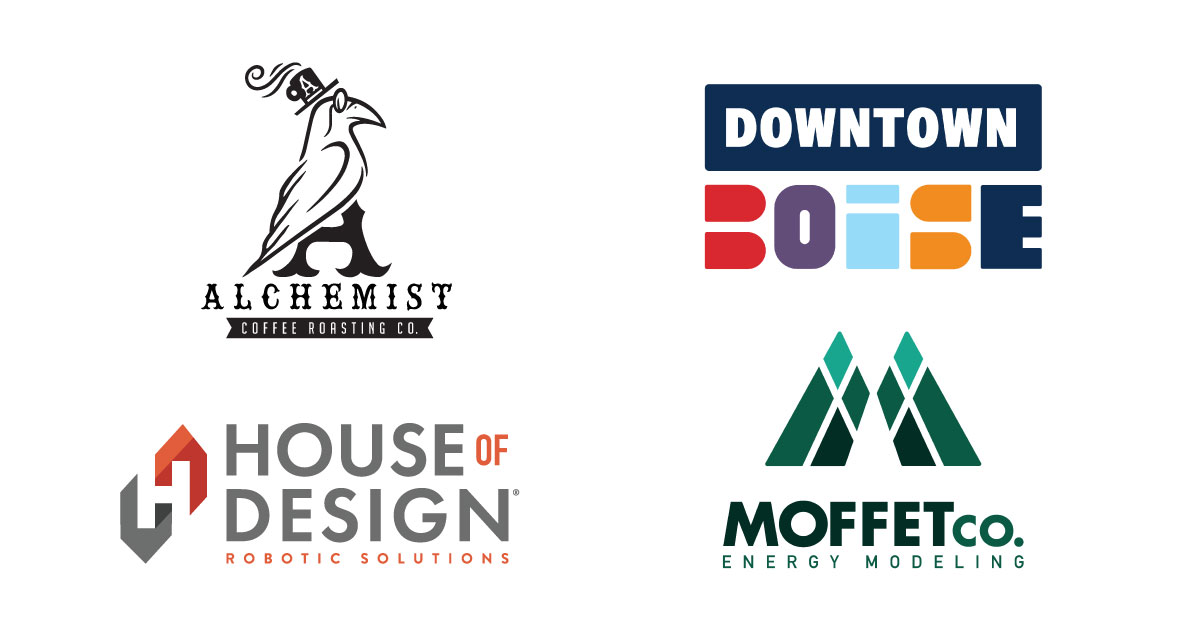
Our creative team members have been busy little bees lately. Luckily, a lot of the recent work on our plates has been logo development. We love the opportunity to take a company’s mark and completely transform it into something that more accurately represents their essence.
Check out a few of the logos we recently created!
Moffet Company
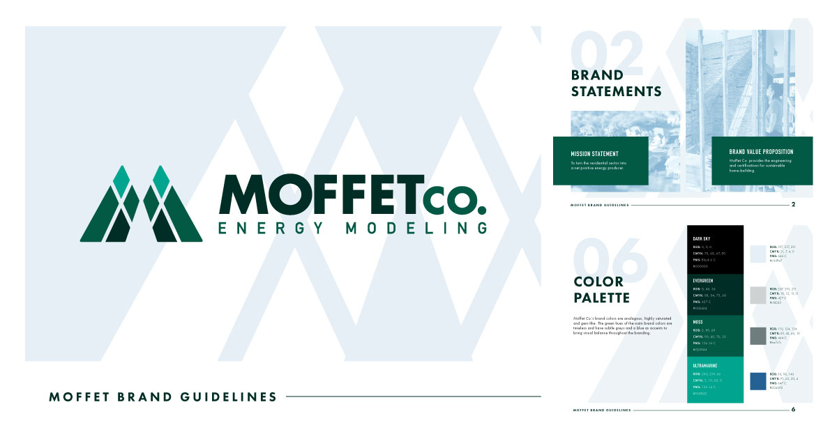
This logo is not only aesthetically pleasing–check out those gorgeous PNW vibes shining through–but was designed with the company’s founders’ story in mind. At first glance, you may only notice the mountain peaks. However, this logo also represents lungs and healthy breathing, which coincidentally* is Moffet Company’s driving force–engineering ventilation that promotes fresh, healthy air without sacrificing energy conservation.
*this was actually not coincidental at all. We did that on purpose. Clever, huh?
Alchemist
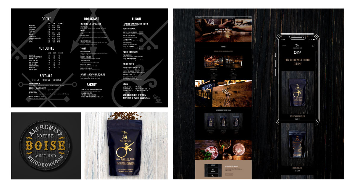
With this logo, we intentionally avoided the typical, pretentious coffee industry aesthetic. Using a crow as the brand’s mascot provides opportunity for branding creativity and the ability to introduce new, interesting elements.
Downtown Boise Association
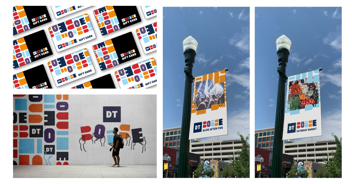
Our main challenge with the logo for the Downtown Boise Association was visually representing all of the different aspects that make Boise such a wonderful place to work, play, and live. (Which is only a challenge because there are so freakin’ many–champagne problems though, right?) To accomplish this colossal feat, we used abstract shapes and colors to engage a diverse crowd and champion inclusivity.
House of Design
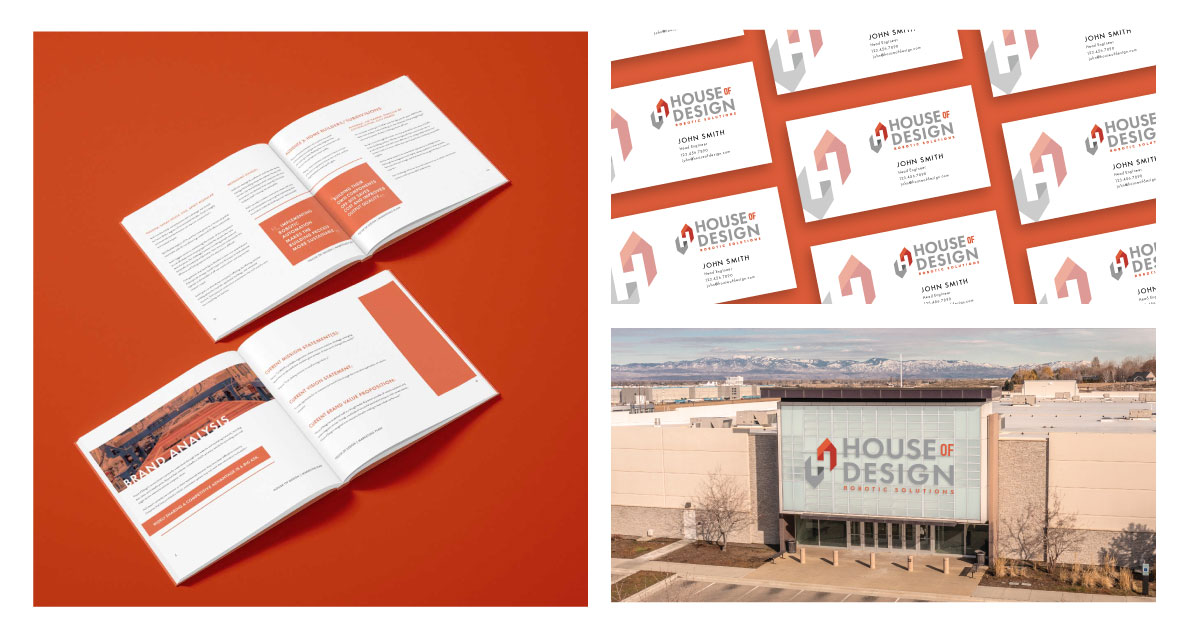
House of Design’s (HoD) new logo represents the strides and innovations they’ve made through the past 10 years. With a slight, abstract nod toward the housing market, this logo also shows off the main focus of the business: robotic automation. The construction industry is crucial right now, and HoD is integral in empowering the American workforce with robotic automation solutions.
New Logo, Who This?
Thank you to our wonderful partners for being so awesome to collaborate with, and for trusting us with projects of this magnitude. We know how important a brand’s logo is, and we’re honored each time we’re chosen as the agency to lead logo development.

