11.25.20 | read time: 6 min
Thinking Inside & Outside of the Box
116 & West
In the before times, when the 116 & West staff would get together for a potluck, you could frequently overhear someone saying “I bought this because of the label. I hope it’s good!” When good (or bad) packaging is brought up now, in 2020, you can frequently see the euphoria-inducing “many people are typing” notification from Slack.
In that spirit, a few of our designers put their heads together to determine some of their favorite pieces of packaging—their favorite aspect, whether they think it’s appropriate for the product, and why they think it’s successful overall. (Their opinions matter because they’re thoughtful, talented, passionate designers; plus, they can back it up with some insanely dope/functional work.)
Isabel’s favorite
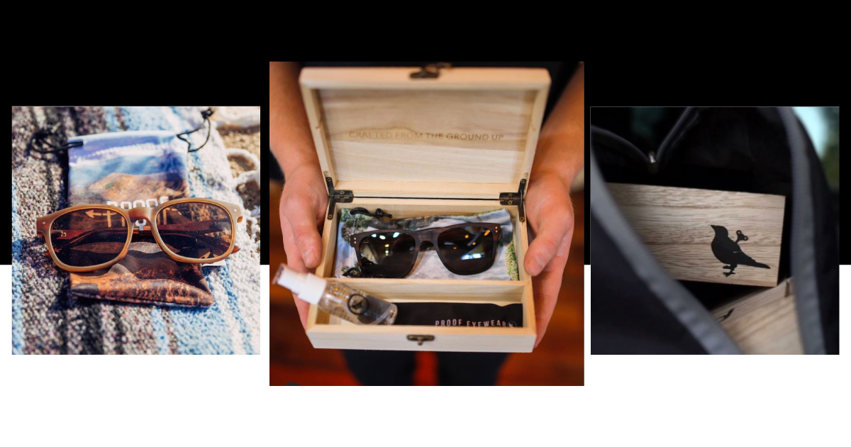
One of Production Designer Isabel Sarhad’s current favs is found at Proof Eyewear in Boise, ID. Isabel believes Proof’s packaging expertly shows off a brand value that sets them apart in the saturated eyewear market: their dedication to sustainability.
Proof’s eyeglasses are made out of eco-friendly wood, and it’s reflected in the packaging. The eyewear is enclosed by sleek, natural wood, which Isabel describes as “genius, aesthetically pleasing, and an extension of the product.”
It doesn’t hurt that this example is trendy af, strongly appealing to its target audience—cool people with poor vision😎 . Isabel explains how trendiness helps contribute to the packaging’s overall success: “It makes you want to buy from them not just for the product, but the experience. All brands should work toward that.”
Christelle’s favorite
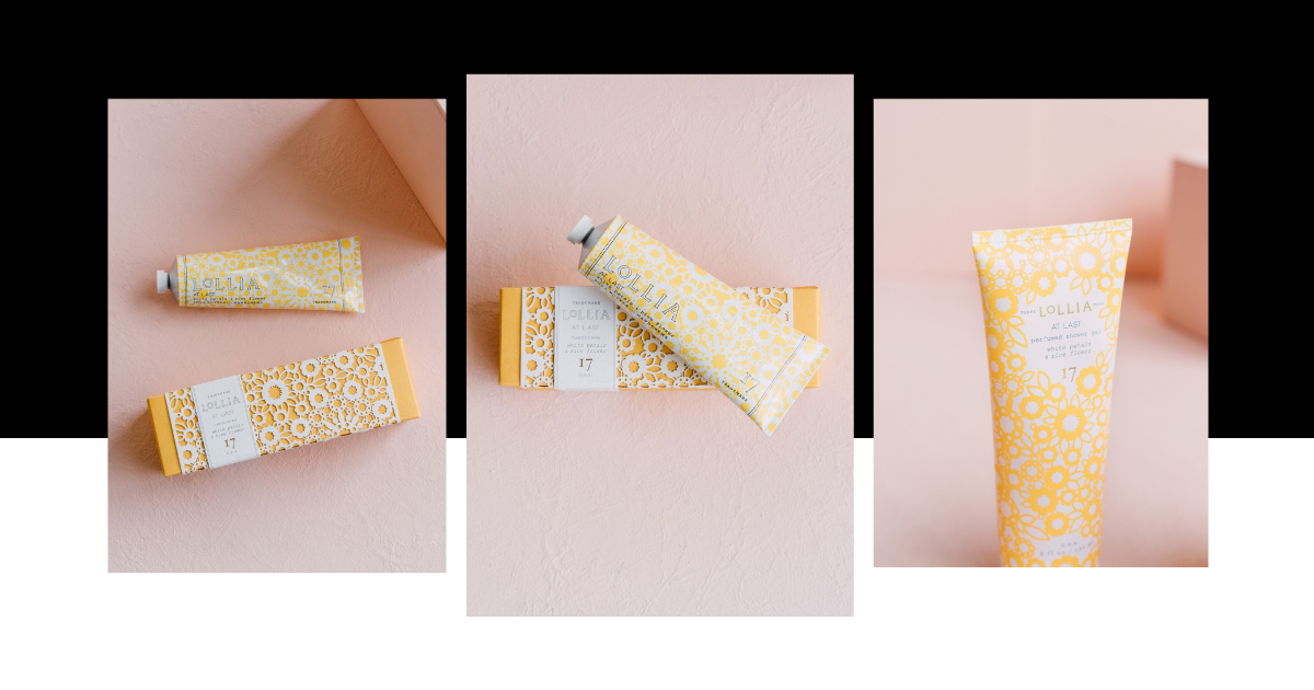
This next example was chosen by Production Designer Christelle Lyman for its intricacies: “The paper on the box is a die-cut which gives a potentially boring space dimension and texture.” Lollia At Last Shea Butter Handcreme employs the same die-cut pattern on the tube of lotion itself, giving the lotion more life, and the product and its packaging more cohesion.
As an all-natural hand crème, this product may appeal more to those who prefer a feminine-leaning experience. But Christelle explained that wouldn’t necessarily exclude purchases made by men, saying, “The floral die-cut is very feminine, but I also think the beauty of the packaging makes it so the product can be given as a gift, without wrapping, which might bring in a few purchases from men.” (Or for themselves; it is 2020 after all.) The details and intricacy exude a feeling of luxury, and that’s something we all deserve this year.
Some retailers offer the hand lotion with a different packaging option. It is three times less expensive, and rather than having the die-cut sleeve as a separately printed piece, the pattern simply printed directly on the box. As for this piece of packaging’s success, Christelle says she would still go with the option with the separate die-cut sleeve at the higher price point: “I think it would make a great gift without the need to wrap it.”
This isn’t Christelle trying to sell you lotion. This is Christelle telling you that this piece of packaging is so beautiful, so well done, that it’s worth paying the extra money.
Megan’s favorite
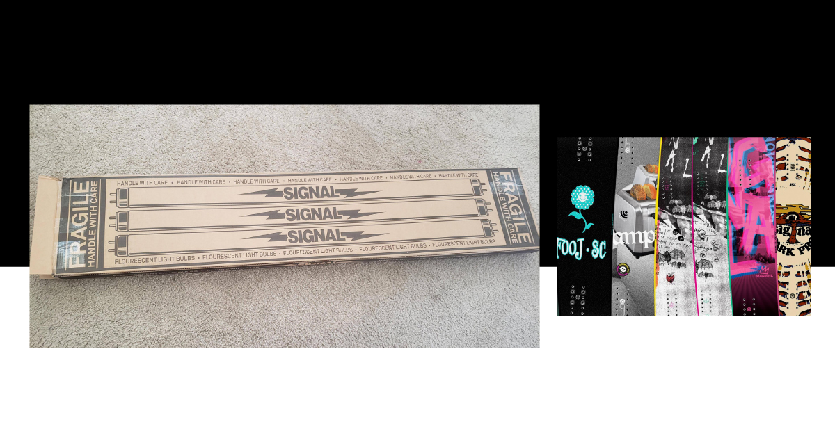
A stark contrast from the feminine beauty found in Christelle’s response is the example provided by Megan Nicholls, senior designer and UI/UX specialist. She explains that when you first receive a shipment from Signal Snowboards, which is known for bold design choices and experimentation with alternative materials, the plain cardboard box can be fairly surprising. Megan concedes this packaging likely won’t be winning any beauty contests but points out that’s not really the point.
“The intention is for the box to be unassuming which serves as an excellent deterrent for any potential porch thieves,” Megan explained. She detailed the steps Signal took to achieve this generic look: uppercase Helvetica in black ink on completely plain cardboard, and the fact that snowboard isn’t written anywhere on the packaging. Instead, it reads, “FLUORESCENT BULBS.”
Megan feels that’s this example’s pièce de résistance, saying “It’s brilliant they found a substitute product that is both unappealing to steal and more delicate, ensuring greater care in transport.” One thing Megan would change is the interior of the box, which is just as plain as the exterior. “It would make for a much more satisfying reveal if you were to open the box and be pleasantly surprised by a bold print that complements your new, beautiful snowboard,” she said.
Kelsey’s Favorite
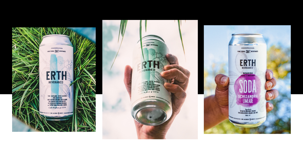
Art Director Kelsey Selis brings us back to beauty and Boise with ERTH Beverage Co.! Both the product’s production and packaging design took place in the City of Trees (by the very rad Against!).
Kelsey couldn’t pick just one favorite aspect, saying “it’s clean, interesting, playful but balanced, with spot-on hierarchy and beautiful colors” and that “the subtle details call for attention but do not take away from the legibility of the type-work.” She explained the overall feeling as bright, natural, holistic, and supportive of the product inside.
The drink itself is incredibly well thought out, and Kelsey says that must be the case for the packaging as well: “There is a lot of thought that goes into these beverages, and the design mirrors that intentionally. It shows that balance of clean yet playful, organic yet strategic, professional yet creative.” When this much thought and love are put into packaging design, it’s bound to be successful. (To other creatives at the very least.)
Mel’s favorite
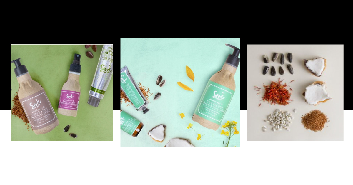
Executive Creative Director Mel Mansfield also coordinates Earth Week for the agency each year, so her initial response about packaging wasn’t exactly surprising: “My favorite types of packaging are those that don’t further damage our planet. I love the brands that are committed to creating a greener future through sustainable packaging.” She also loves when companies employ packaging that include instructions to create things—origami, animals, directions to make a fort or a mask, anytime that a package also fosters creativity instead of immediately getting thrown away.
Mel is currently really impressed with Seed Phytonutrients. She explained that their products come with a packet of seeds hidden behind each recycled, recyclable bottle. (Yes, that is a bottle that is made from recycled products that can be recycled again. New tagline alert: Reduce, Reuse, Recycle, Recycle, Recycle, Recycle, Recycle… you get it.)
Mel appreciates that the organic and earth-friendly feelings of the brand are reflected by the simple, 2-color label on top of kraft-colored paper. She feels “this packaging approach can help consumers to feel good about their purchase as if they are participating in something bigger than just buying shampoo.”
All wrapped up
Next time you find yourself in a commercial setting without a plan, check out the different packaging. Pay attention to the details, and let yourself select the product that speaks to you—it was likely created to speak to its target audience.
Thanks for nerding out with us about packaging. If you’re looking for a partner who will absolutely match your level of excitement for your packaging project, reach out to whatsup@116andwest.com and let’s revamp your cans, bottles, boxes, cartons, and/or personalized packing tape.
Note: We are not receiving any form of compensation for talking about any of these products/companies. We’re just nerds who really love what we do.

