10.24.23 | Read time: 4 min
30 Years of Brand Building, One Logo at a Time
116 & West
Trauma, domestic violence, and homelessness are hardships that affect people of all ages. In Spokane, Washington, Volunteers of America | Eastern Washington (VOA) leads the charge in addressing the needs of those who are experiencing these challenging situations, both youth and adults.
Since 1985, VOA has run the Crosswalk emergency youth shelter in downtown Spokane for the city’s adolescents and children. As needs increased, VOA expanded its services to include Hope House, an emergency shelter for adult women, and YAS—Young Adult Shelter, a shelter for young adults aged 18 to 24.
VOA chose 116 & West to execute visual branding on all three facilities, continuing our agency’s three decades of work on these projects.
How it Began
In the late 1980s, we partnered with VOA to develop a visual brand for Crosswalk. This facility is a safe and secure shelter for teens and provides clothing, showers, hygiene products, life skills training, employment readiness, and family reconciliation services.

We designed a youthful logo depicting a home and a shining sun to convey warmth, hope, and a brighter future. This logo represented Crosswalk for over 30 years.
A Design for Hope and Safety
In 2020, VOA replaced their aging Hope House facility, in operation since 2001, with a new women’s shelter for Spokane, a facility for women experiencing homelessness and needing protection from street violence. With this next chapter, it was an opportunity to update the Hope House identity with a new logo.
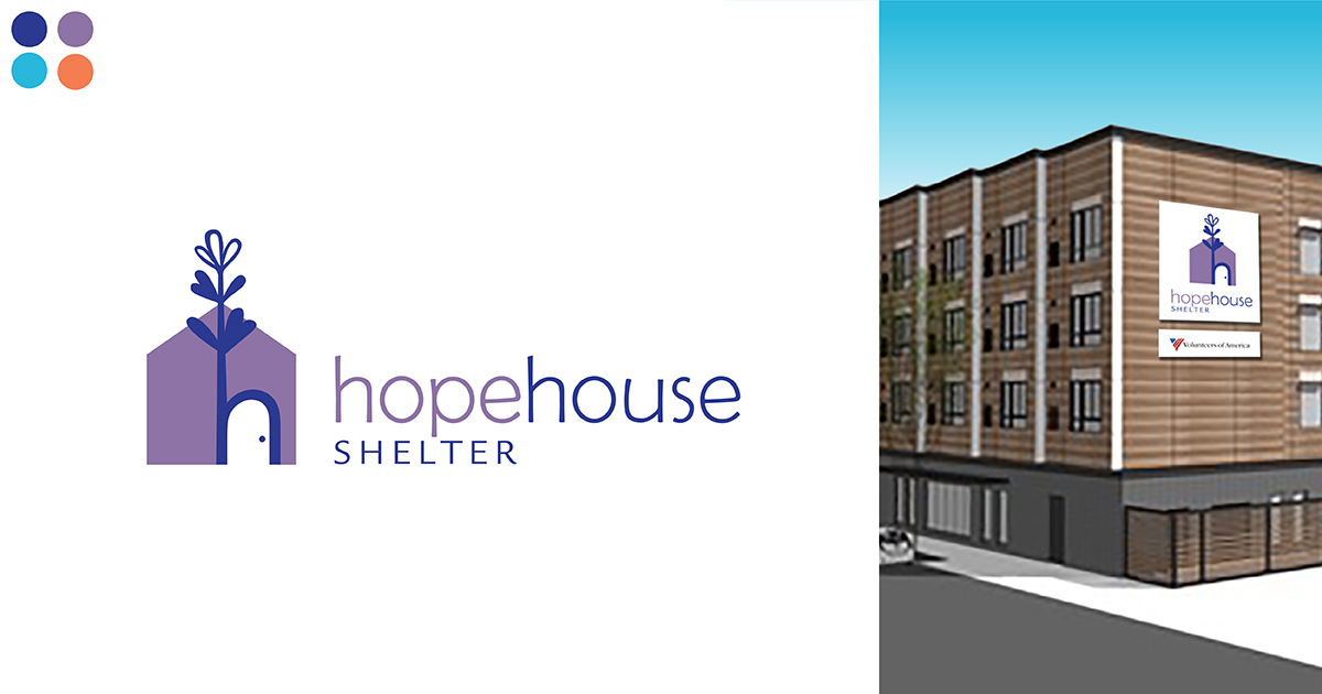
We designed a new logo depicting a symbolic house and flower growing from the h-shaped doorway. The intention behind this logo is to be welcoming and appealing to women, conveying protection, caring, and shelter — a place with a warm bed, supportive services, and programs to get women back on their feet.
Needs Beyond the Teen Years
As overnight shelter, case management, and housing resource needs increased for young adults older than those served by Crosswalk, VOA began construction of a new Young Adult Shelter (YAS) in 2021 to serve individuals and couples aged 18 to 24. The YAS needed a visual brand welcoming to young adults of all genders and identities.
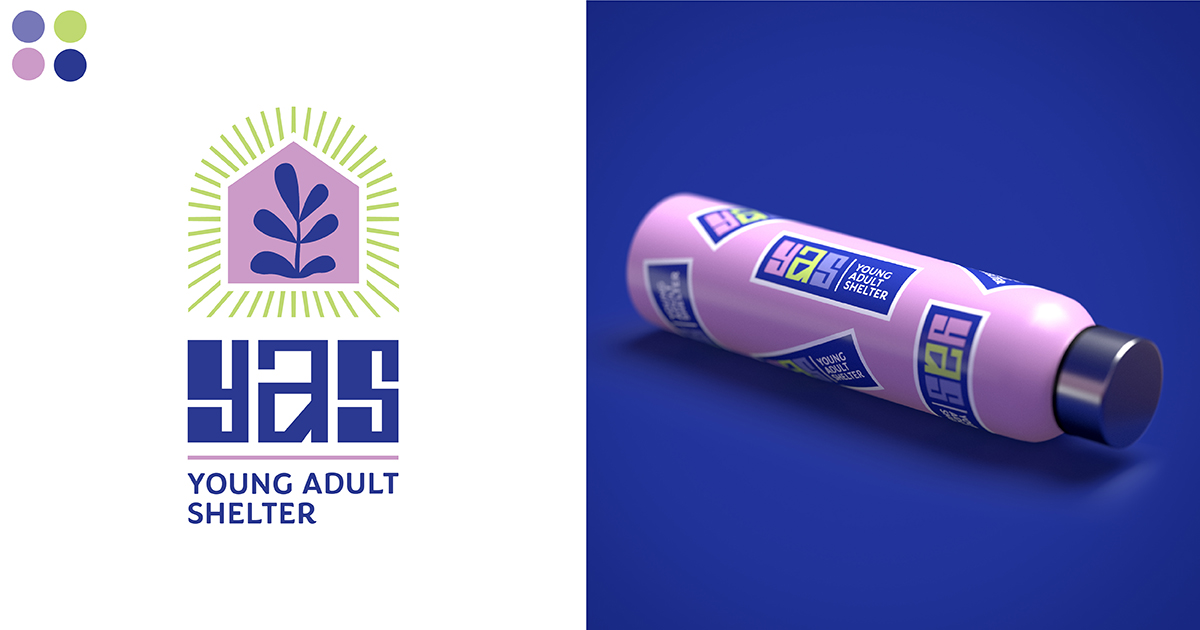
The facility provides overnight services, case management, and housing resource specialists. It is a secure environment intended for young adults to get their lives back on track and then re-enter society. Our creative team designed a logo building on the symbolic home surrounded by light rays, sheltering a vibrant plant – a visual representation of a safe, stable, trustworthy place where young adults can “outgrow the system.”
A Fresh Look for Crosswalk
As the VOA brand family evolved and the needs and interests of youth changed, it became clear that it was time to rebrand Crosswalk. This youth shelter needed a logo that would appeal to today’s youth while conveying the care, protection, and services offered to gain stability, trust, and confidence to achieve the life they want.
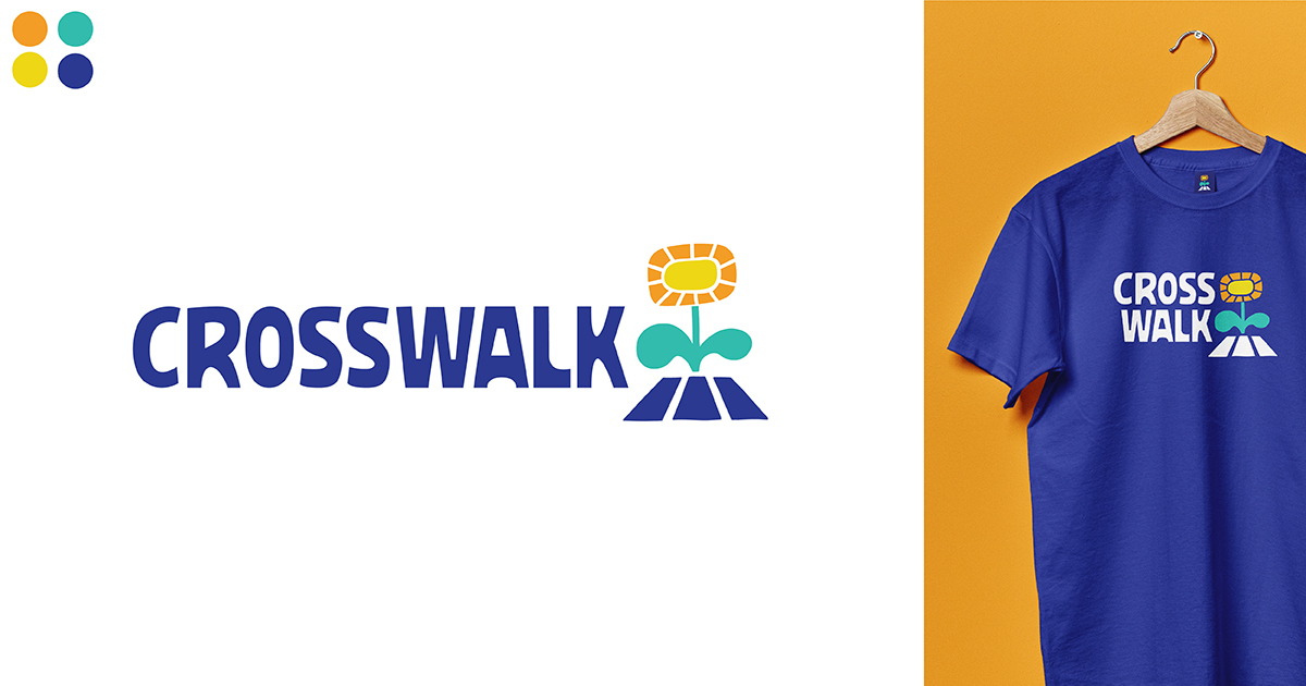
The logo design consists of a striped crosswalk that visually connects the image to the name, with a vibrant flower growing from its center. The design communicates a safe, protected path for growth despite adversity. The custom typeface is contemporary, approachable, and designed to appeal to a younger audience.
A Kaleidoscope of Color
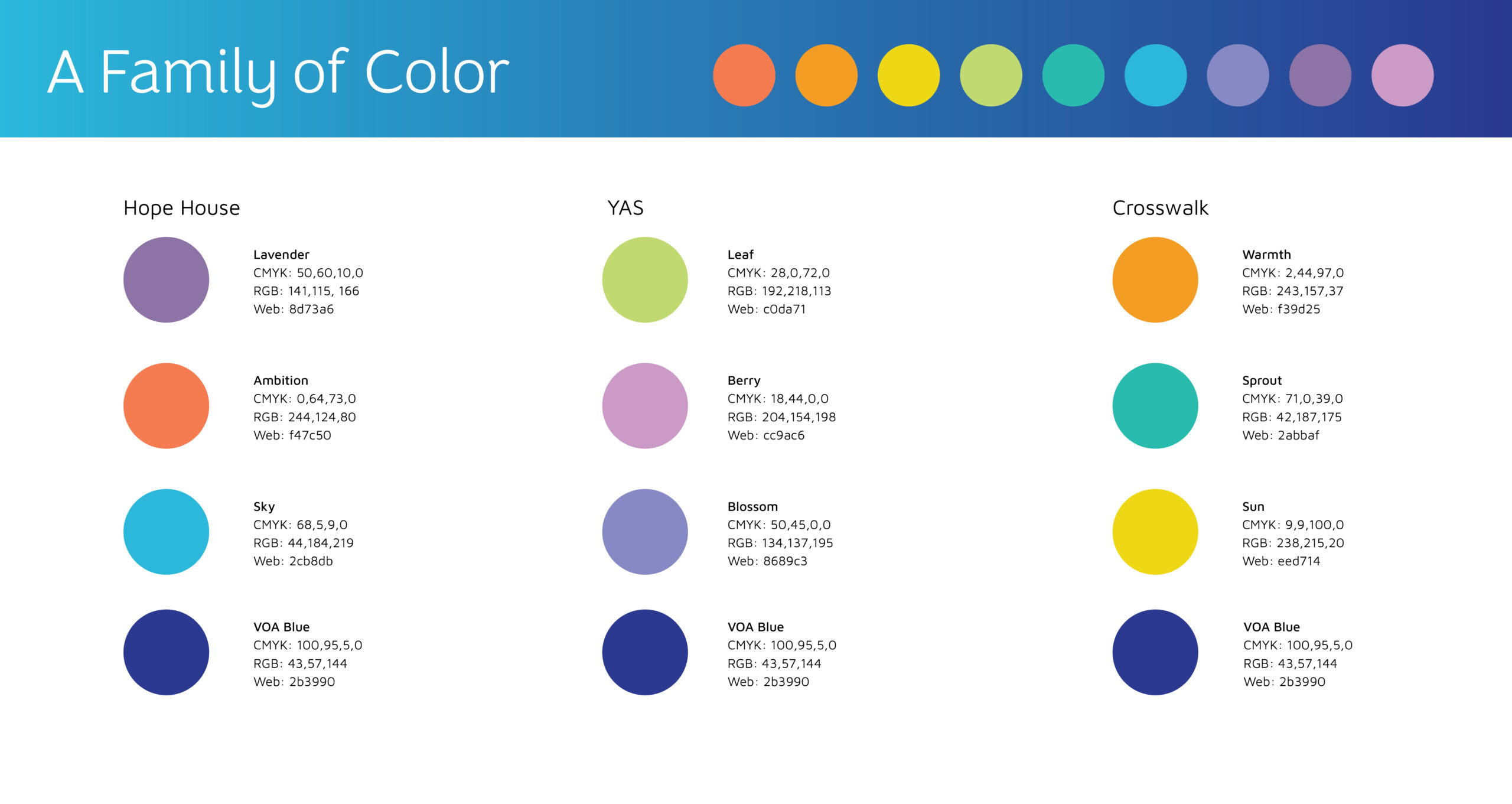
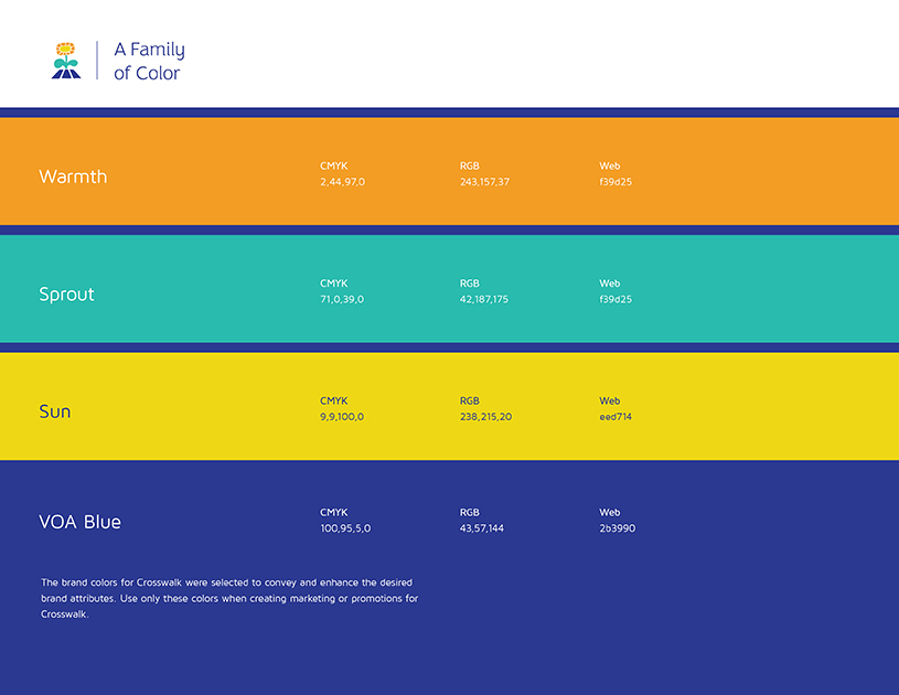
Over the course of three decades, our design team developed a cohesive family of colors across all three VOA entities. For YAS and Crosswalk, we used colors that would appeal to a younger generation – bright, optimistic colors, like sun yellow and lime green, are paired with darker, richer colors. All three logos share the same dark blue to generate color consistency and unity. The yellow from the Crosswalk logo complements the Hope House colors, creating an updated palette that brilliantly creates a perfect rainbow. Overall, the palette is energetic and hopeful, appeals to the various age groups they are targeting, and fits the range of services and facilities VOA represents.
Brand Guidelines
The VOA staff is now empowered to use its complete brand family. Audiences will now make a connection across its facilities due to the visual association of the same dark blue and symbolic growing plants. By developing comprehensive brand guidelines that describe the brand attributes, logo formats, colors, typography, and logo usage, VOA staff can use it in various applications. This document ensures that VOA and its vendors can implement each logo correctly to build brand awareness, develop brand equity, and strengthen the impression of the organization’s different brands.
Brand Building Sets You Up for Success
With an effective brand family design and comprehensive brand guidelines, VOA can market its services and products, knowing that the visual brand conveys important attributes to its target audiences. Whether used in print promotions, signage, websites, social media, traditional advertising, or digital marketing, these brands serve as symbolic ambassadors, representing the organization wherever and whenever they are seen.
Beginning with strong brand imagery is one of the keys to effective marketing. It’s a win-win for our agency and our clients. With strong brand imagery, VOA can better reach its audiences and promote facilities, services, and programs to improve the lives of those experiencing homelessness.
