7.27.21 | read time: 2 min
Brenmor Scores A Brand New Site
116 & West
The digital department launched yet another website–this time for Brenmor, a technology-driven company that helps medical groups and health plans improve their patient care by providing custom, qualitative surveys. Considering how invaluable a functional, informative website really is, helping companies with this kind of project is incredibly rewarding.
Our relationship with Brenmor began years ago when we did work for the client’s previous company, AgentCubed. To continue to grow this partnership with this website was an honor.
This project was a unique challenge. We’re glad to say that it was hugely beneficial to both parties.
Brenmor’s Needs and Our Solutions
Brenmor came to us wanting a few key enhancements to their current site:
- A better way to track leads received via the contact forms on their previous website.
- To engage their target audiences with quality content.
- To establish a new look and cohesive brand that speaks to their important differentiators.
To achieve all of this, we made several moves. To help track leads, we connected Brenmor’s forms to their Microsoft Dynamics CRM (customer relation management) software. Doing this helped consolidate every message submitted through their website into one location.
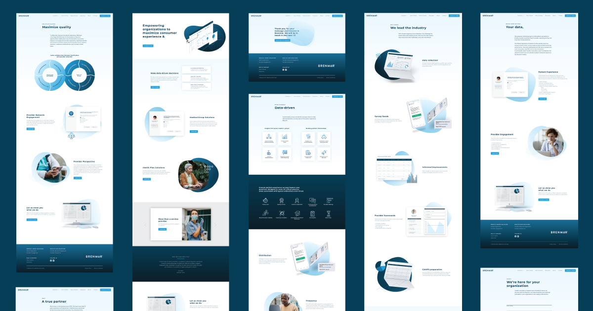
To engage their audience with quality content, we elevated the look of their site, which in turn elevates their entire brand. It’s now clean, professional, and modern and speaks to their tech-savvy audience. Functional improvements we made to Brenmor’s site include multiple custom post types for news, events, health care resources, and video player support.

The main actions Brenmor wanted end users to make was to either schedule a demo or contact them. If you click through and visit their site, you will see the “Schedule a Demo” button featured prominently within the hero image. Additionally, if you were to jump around the site, you will frequently see that same button on various pages. On the top right, you will also see a “Contact” link that directs you to the contact form.
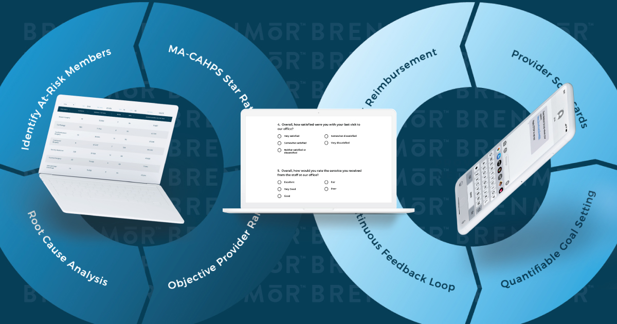
One of the taller tasks for this site was explaining the nuances of how their services differ from their competitors. To accomplish this, we implemented several visual aids and iconography. We used these visuals in lieu of their actual product dashboard to more easily convey what they do, without giving away any proprietary information.

Let’s Work Together
We’re thrilled to partner with Brenmor and working with them on this project was a true delight. Make sure to check out the site yourself, and be sure to contact us with any web needs!

