4.28.21 | read time: 3 min
IBE’s Website and Logo Update
116 & West
Idaho Business for Education’s (IBE) mission is to be a driving force in creating and eventually supporting an education system in Idaho that produces more capable workers. Additionally, IBE seeks to increase the number of Idahoans who pursue post-secondary education. Their work consists of collaborating with state administrators to enact policies and investments that support Idaho’s students and teachers.
A valiant cause, right? Any agency would be lucky to partner with an organization with such a positive charge. As a result, we were really excited when we won IBE’s partnership via RFP to update their website and logo.
IBE and Our Collaboration
In addition to branding and web development, we also provided content strategy to help streamline their messaging, collaborating with IBE every step of the way. In effect, our goal was to help their target audience better understand what they do and how they influence positive change.
A functional website and memorable branding are crucial for IBE. As they attempt to improve education on the state level, it’s imperative their logo makes an impact on policymakers and potential new members. Moreover, their website is a key resource for education news, recruiting new members that help to support their mission, and generally spreading awareness about their cause.
Knowing all this, we set to work.
A Logo with a Facelift
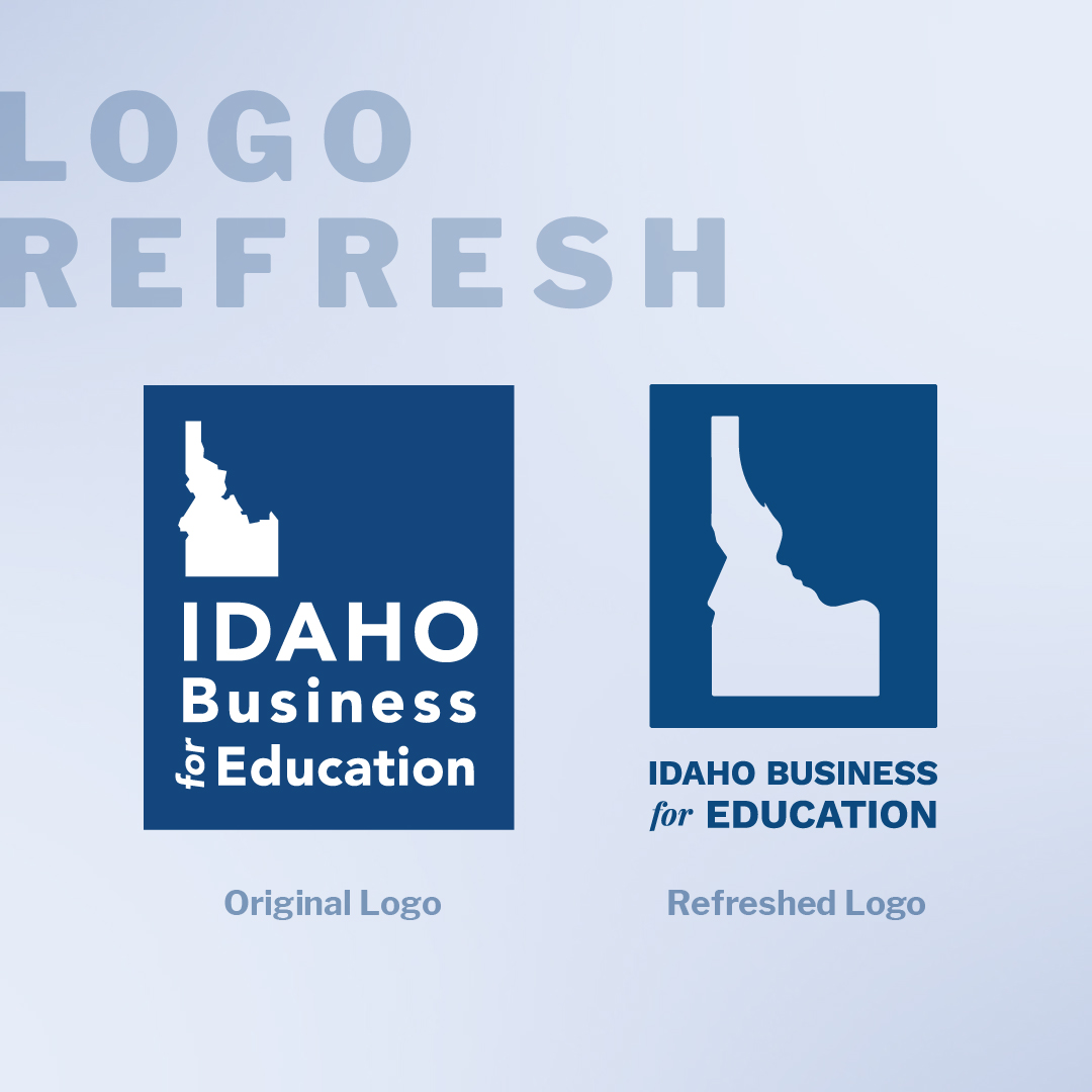
We refined and livened the brand’s concept and tag of “Great Schools are Good Business” by adding a subtle child’s profile to Idaho’s right border. Borrowing inspiration from a logo that IBE loved made for their Making a Difference program, we incorporated the child’s face into their main mark to add character. It also makes it more memorable and strengthens the organization’s narrative around Idaho’s education system and the surrounding communities.
For coloring, we utilized a strong brand blue to affirm trustworthiness, composure, professionalism, and intelligence. The new mark was then paired with a strong typeface called Work Sans, and a classy accent serif Playfair Display.
Finally, we created and supplied IBE with a variety of formats of the logo to be flexible with their needs, and aid in brand variability.
Check it out for yourself:

Just because a client comes to you for identity work doesn’t necessarily mean you need to completely reinvent the wheel. Oftentimes, branding work is best when it’s informed by what has already been done.
Web Design and Development
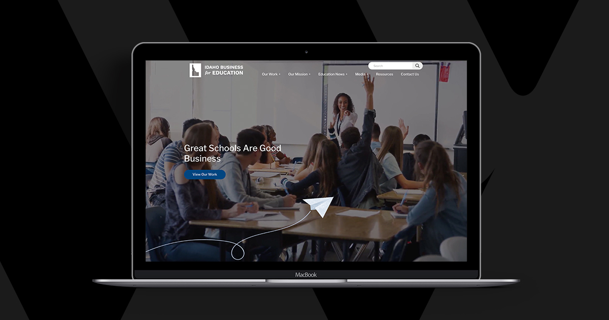
Functionality and accessibility are at the forefront of every web project we take on, and our work with IBE was no exception. As far as accessibility goes, IBE’s new site was designed and developed to WCAG 2.1 Level A accessibility standards. (This means that through the design, we’re ensuring that all people, even those with various disabilities, can easily navigate the website.)
To improve the overall functionality of IBE’s site, we made some key page additions. We created new forms to help simplify IBE’s membership inquiry process. We also bolstered their media page, allowing for an increase in reach through new commentary and video sections–and, if we’re lucky, maybe even a podcast section in the future. Another major addition is the expansion of their program page. This gives IBE the platform to properly speak to their program’s goal and process.
On a content level, we collaborated with IBE to clarify their messaging through streamlined copy and clear calls to action. (Website visitors should never struggle to find the information they’re seeking.) Lastly, we elevated the overall aesthetic of the site with a new polished, professional design in the hopes of attracting new members.
Please, go take a look at their new and improved website yourself!
Let’s Work Together!
We’re honored to work with IBE, to have the opportunity to refresh their website and logo and help this organization thrive.
If you and your company are considering updating your branding or web development, drop us a line. We’d love to help elevate your messaging, too.

