12.18.23 | 3 min
PANTONE Color of the Year: Catch the Fuzz
116 & West
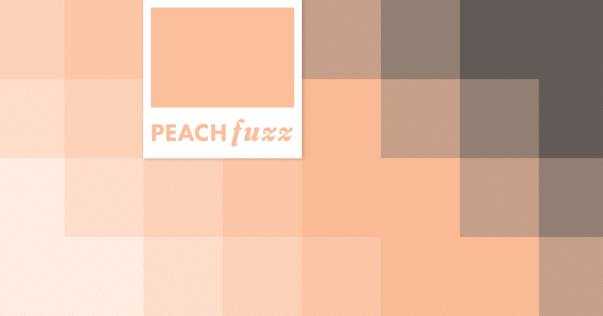
PANTONE Color of the Year Eve, aka December 6th, is like Christmas Eve for designers and all color enthusiasts. Giddy with anticipation about which color would be chosen, our team made predictions about which hue the PANTONE Color Institute would select for its 25th year. Though none of us got it right, it didn’t temper our excitement for the 2024 winner, 13-1023 Peach Fuzz. PANTONE has rightfully earned its place on the cutting edge of color forecasting, and this year’s winner is shaping up to be no different.
How is the PANTONE Color of the Year Chosen?
Twenty-five years ago, the PANTONE Color Institute began a global conversation around the universal language and perpetual power of color. Each year’s selection acutely captures the zeitgeist. PANTONE Color of the Year 2023 was 18-1750 Viva Magenta, and as we all know, we couldn’t escape the magenta color that dotted our screens big and small during the summer of Barbie.
Global color experts at the PANTONE Color Institute seek what influences entertainment, art, fashion, design, technology, and sports. These “color anthropologists” hail from various backgrounds, but all possess expertise in design. Research, trend analysis, and consistent conversation over the year result in a Color of the Year that rises above the rest, universally agreed upon by all members.
Why Peach Fuzz?
The PANTONE Color of the Year is a collective mood, a snapshot of a moment in time. The impact of color is universal, evoking a range of emotions. Peach Fuzz, in particular, conveys kindness, warmth, and compassion. It is comforting and modern, calming, and soft. Peach Fuzz has a vintage feel yet is elevated enough to live in this contemporary space. Some may point out (I will) that we experienced a foreshadowing of Peach Fuzz in October with the tangerine vinyl of 1989 (Taylor’s Version). Tangerine will henceforth be known as the 2024 PANTONE Color of the Year (Taylor’s Version).
116 & West Designers Weigh In
Though none of us predicted the color, we still have thoughts on what it means and how we plan on using it in our work. Here is what the team had to say about the 2024 pick.
Graphic Designer and man of few words, Kameron Simpson thinks Peach Fuzz is “very Wes Anderson,” especially considering the color grading of his 2023 film Asteroid City.
Senior Designer Aaron Ellis tells us Peach Fuzz “is giving sensual, subdued vibes. At the same time, it’s also versatile and approachable. In past years, we have seen vibrant colors take center stage. Peach Fuzz can play in the background and be paired with countless other colors.”
Art Director Tiffany Patterson is “always excited for more complex and subtle/nuanced colors to gain popularity. I do wish it glowed more (mostly because I’m a huge fan of a florescent peach). It’s warm and cuddly, and its magic will emerge when paired with other colors.”
Designer Ryan Davidson said, “It feels very human, in the best ways—warm, welcoming, and kind. I could see myself using it in design work to communicate a welcoming or empathetic message. In some sense, it feels like the right color for a post-pandemic world attempting to reshape what it wants the community to look and feel like. It’s uplifting and positive.”
Integrating a color like Peach Fuzz that pairs so well with others has us coming up with endless marketing ideas. We are excited to potentially implement this color into our client work in the coming year. After the boldness of Viva Magenta, we are looking forward to a year that is lighter, cozier, and fuzzier.
Wanna have a fuzzy year together? Get in touch.

