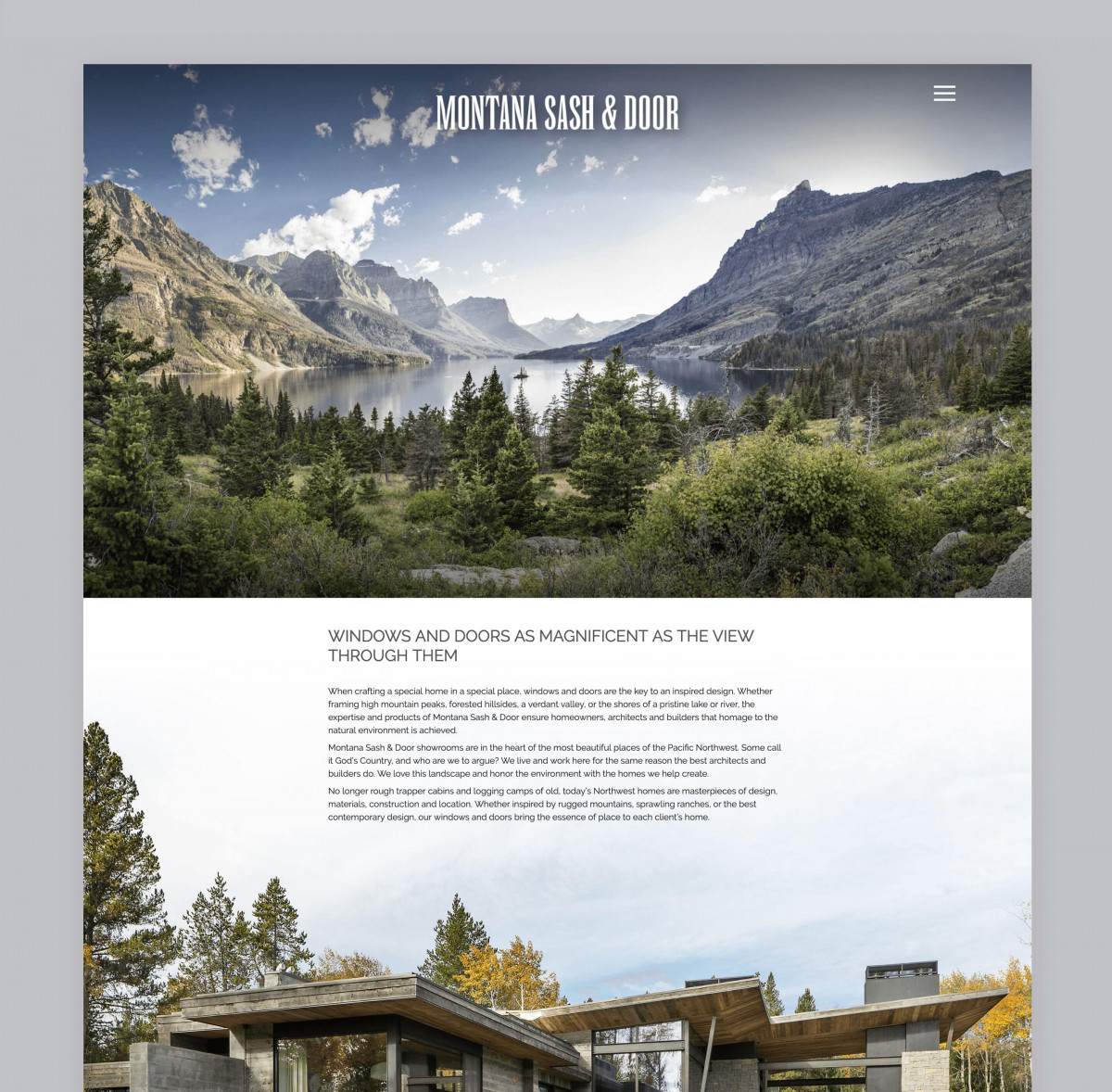
The Background
Montana Sash & Door provides exclusive window and door products for architects, builders, and homeowners in Montana, Idaho, and Wyoming. The company’s product line delivers state-of-the-art window design and performance. Its experienced staff guides design and brand recommendations to achieve aesthetic and performance goals for their client’s exclusive homes.
The company came to us to design and develop an updated brand image, graphic standards, and new website that properly promoted their products and services to their target audience’s discriminating tastes.
Updating The Brand Image
Branding work began with their team completing a brand survey. Based on survey responses and team interviews, we collaboratively determined key communication attributes for the new logo design. The resulting corporate image symbolizes the northern Rockies and mountain views as seen through the windows and doors of the high-end Montana Sash & Door customer homes.
The look of their logo is sophisticated and progressive, with a bold uppercase font conveying confidence, reliability, and stylish design. The logo ties into the outdoors and appeals to their high-income, environmentally conscious clients.
We began work on their website by creating a site structure that quickly provides the visitor with desired information. The site design incorporates the beautiful geography of the surrounding locations with the beauty of the client’s home.
Site content communicates the essence of Montana Sash & Door and the importance the company places on honoring the natural environment through the homes they help create.


