4.16.24 | 2 min
Why Tether RE Stands Out in a Sea of Real Estate Apps
116 & West
Rebranding an app in an already saturated real estate market is a challenge. But we love challenges. To execute this for our client, Tether RE, we developed an innovative strategy-driven approach. Breaking through the noise of the competitive landscape of real estate apps required a sharp focus on the brand’s USP. Tether RE is a real estate safety platform that integrates multiple technologies. It’s everything a real estate agent could want in an app, with the important added bonus of several safety features. It was time for Tether RE to level up its brand, breaking through the noise to reach a broader audience and, quite literally, save lives.
Refining Our Approach
Real estate agents are in a field where they need to be extra cautious for their safety. When agents show houses to potential buyers, they are often alone, a vulnerable situation for anyone meeting a virtual stranger. Tether RE has the technology features to quell fear around an everyday part of the job. The app includes a preset timer that starts automatically when an agent arrives at a property and alerts emergency contacts if it is not stopped.
It was important to Tether RE that real estate agents give their input during its initial build. Agents are constantly bombarded with new apps; this one had to be different. With these critical recommendations, Tether RE could break through the crowded field of real estate apps by showcasing its advanced security features and ability to integrate functionality from other platforms, creating the one app that real estate agents need.
Our strategy was to refresh the brand and use clear and persuasive language to communicate the need for Tether RE while visually showcasing the app’s essential features. We completed this brand refresh under a tight timeline, including logo refinement, a brand guide, a custom landing page, and sales collateral, including art direction, copy, and design.
Creative Strategy
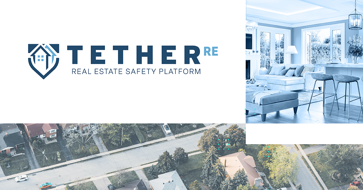
The brand refresh for Tether RE included adjusting its logo and creating a more modern look with a new typeface and elements to convey the security that this app offers. Integrating a shield into the refined logo helps to communicate an app that concentrates on defense, safety, and trust. The new mark tells more about what the app does than it previously did. The user subconsciously understands this app without knowing everything it can do.
Inspired by architecture and floor plans, we created a custom grid for the foundational element of Tether’s look and feel. This layout lets us mix and match professional photography with branded color blocks to create more negative space for copy and product mockups to live. Then, we integrated photographs of neighborhoods and cities, high-end real estate, interior design, and individuals in business attire. Utilizing a variety of configurations, we mixed and matched the treatment of the photographs to increase visual interest. By brightening and cooling down the darker tones of the full-color photo, there is cohesion with the blue-toned monochromatic images.
Photography communicates the focus of Tether TE, but we also needed to acknowledge the technical side of this app. An element of visual texture, in the form of strategically placed patterns, formed Tether’s “greenlight” color. This culmination of elements created a clean and interesting layout that formed a recognizable and professional-looking backdrop for Tether’s message and ultimately drove the direction of its visual brand identity.
If you’re looking to elevate your brand to new heights, get in touch and check out our full list of happy clients.

